Using Images
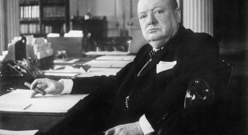
Hey which likeness of Winston Churchill inspires you to weather out a bombing run more? This one:

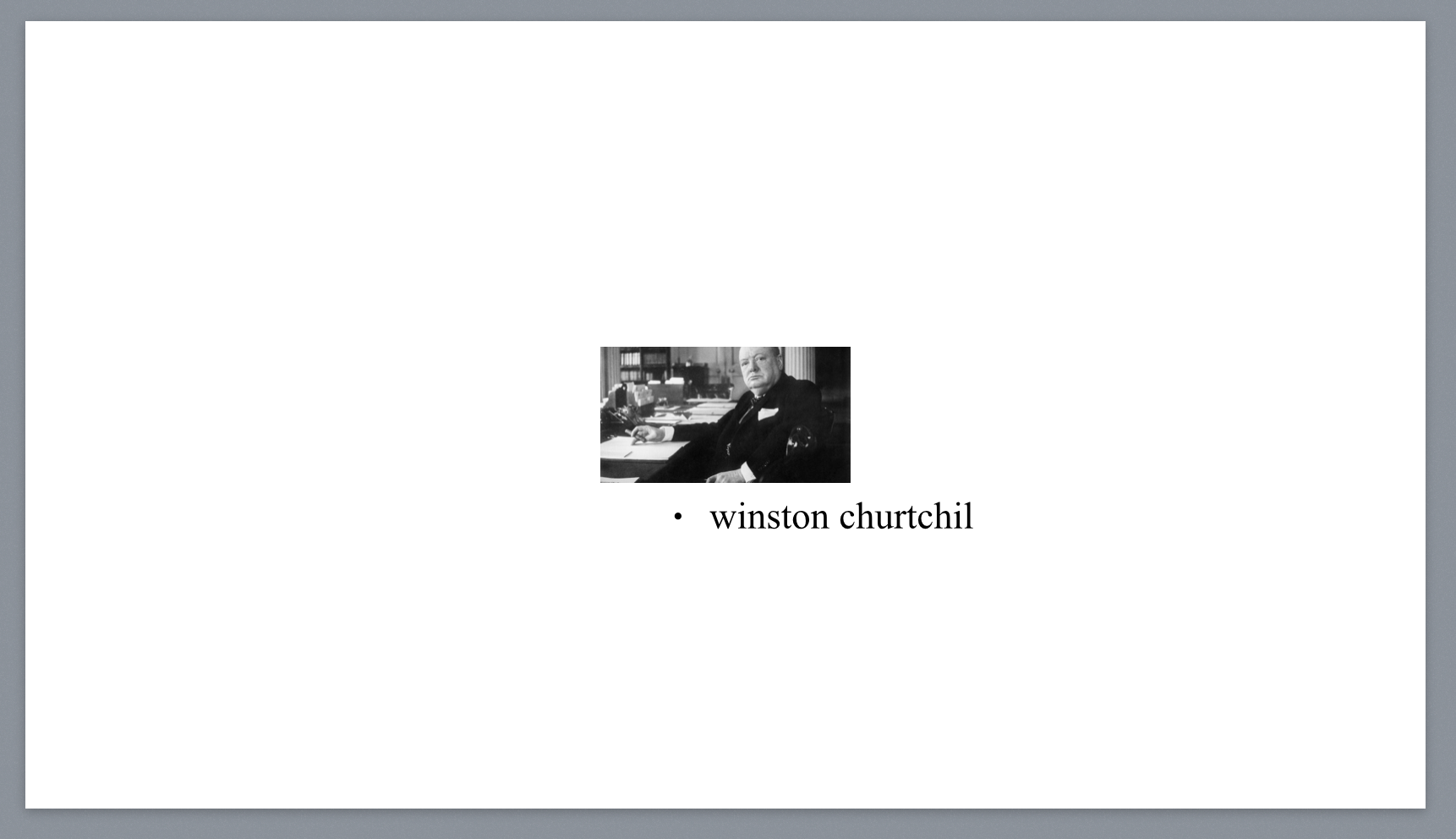
…or this one:
  o   - HEY IM WINSTON CHURTCHIL
 /|\
 / \
If I had to guess, you either picked the first one, because it is a vibrant image full of evocative character and unbroken will, or you picked the second one because you are a jerk and just wanted to mess up my example.
What I’m trying to say is that even more than plain text, images can really make things pop for your audience (unless they’re all jerks).
Finding a photo
I really like photos. It’s hard to describe why I like them so much, but I came up with a phrase that sums it up pretty well: a picture is worth a hundred million words. Photos can capture attention and interest quickly and without much effort, so you might want to include them in your slide deck.
If I’m designing something that needs a good photo, more often than not I’ll toss one of my photos in the slide. It can be fun to chat with people about certain photos they might notice in the deck and be able to say “yeah, I took that”. If you’re at all into photography, give that a shot. You’d be surprised at how good even cell phone photos can look these days.
If you’re not a photog by any stretch of the imagination, there are plenty of places you can find royalty-free photos online. Flickr has a great Creative Commons search, and even Google Images’ advanced search has a nice “usage rights” section you can filter by.
Using a photo
Once you have a (preferably big, high-quality) photo, toss it in your slide deck. But for the love of god, don’t do this:

Again, keep things as simple and as big as possible. Blow it up to the whole slide:

Dealing with text
In that last screenshot, I used a couple quick tricks to make the text more legible.
Play with levels
For one, I turned the exposure down. You can do this either in a different program or, in this example I just did it directly in Keynote:

Basically, it makes the whole photo darker. It might make the photo as a whole a little harder to make out, but your focus is on the legibility of your slide deck, not photorealistic renderings of some random photo you have up on screen for four seconds.
Put another backdrop under the text
Usually playing with the levels of the photo is fine, but in the Churchill shot I had a harder time placing the brighter pink text over a lighter grey background. So, I cheated. I added a black rectangle behind the text:

It’s not a full black; it’s at about 70% opacity, so some of the background bleeds through, which I think is a nice enough effect. I just wanted that slightly darker so the text would pop more.
You can use drop shadows for the same type of effect as well: just make them offset by 0px and don’t blur the shadows too much, otherwise you start to lose the effect some.