Duplicating Objects
Have you ever seen The Fly starring Jeff Goldblum?

Basically Goldblum — the kooky mad scientist he is — invents a teleportation device, but when he tries it on himself, a housefly sneaks into the machine with him and Goldblum comes out the other end half-fly, half-Goldblum. Definitely should have won a Grammy, but the point I’m trying to make here is that Goldblum probably would have been better off duplicating himself instead of mixing his DNA up with some lameazoid insect. Had that happened, we would have had ended up with two Jeff Goldblums and the world would have been noticeably better off.
Quickly building things up
In Keynote, I use ⌘D religiously. That’ll duplicate whatever you have
selected: slides, objects, text, groups of slides, groups of groups of text,
small rodents, whatever.
It’s kind of amazing how much time this saves me. I feel weird writing about it because there’s nothing special about it: I’m just duplicating shit. But when you’re dealing with text styles and specific font settings and colors, it makes a ton more sense to just grab what you need and bring it over to a new slide.
The scratchpad slide
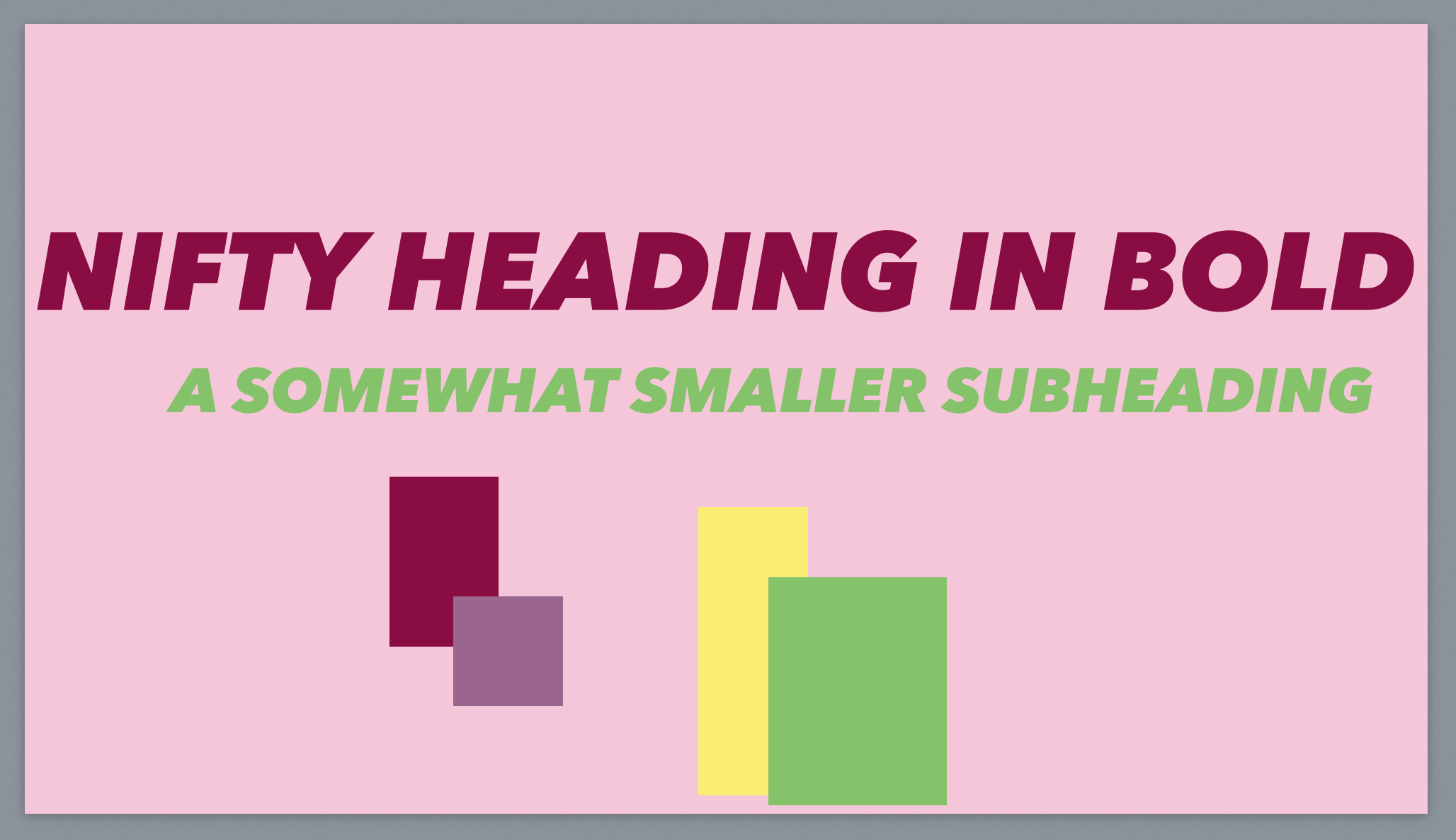
One way I leverage duping quickly is to build a scratchpad slide at the start of my slide deck. It has big chunks of things I might use later in the deck. Here’s a quick example of one:

Delete this slide before you give your talk, of course. It’s just there for you quickly copy styles back and forth between slides.
You can also use Master Slides for this purpose- basically you set up one overall style in your Master Slide and you can change all the rest of them from that one spot. Personally I tend to make each slide a bit unique, so I don’t use Master Slides all too often.
Advanced: The no-shift
I’m pretty sure I’m the only one who notices this in the entire planet, but it’s something virtually everyone messes up. Fixing it makes for a more pleasant slide deck overall, so this might be interesting to you.
Imagine you have this slide:

And then you build this slide:

Does that bother you much? Probably not, because we’re building the slide deck and we don’t think about things like flow while we’re building it. But let’s take a look at it as your audience will see it, one slide transitioning to the next:

See? Much easier to notice the text jumping around (and even the background image gets offset a few pixels). Compare that to objects that have been properly duplicated-in-place:

It’s super subtle and maybe no one will notice it, but I think it’s a nice way to polish your presentation.